BRAND FEEDBACK RESEARCH | ENGAGEMENT EXAMPLE
Does a minimalist skincare identity improve pharmacy credibility or make the brand feel generic?
An identity signal study in Palermo and Catania, Sicily
THE BUSINESS DECISION A pharmacy skincare brand planned to simplify its identity and packaging. It needed to know which visual and verbal cues created clinical credibility, which made the range recognisable on shelf and where minimalism removed too much meaning.
24 INTERVIEWS
Consumers and pharmacy professionals
108 CONSUMERS
Structured option measurement
3 IDENTITY ROUTES
Randomised monadic exposure
8 WEEKS
Example delivery window
Whose perception mattered
The study included recent pharmacy skincare buyers because they interpreted the identity at the point of choice, and pharmacists because their recommendation could strengthen or contradict the brand signal. Internal design preference was not treated as market evidence.
Why Sicily was specified
Recruitment covered Palermo and Catania, with a mix of neighbourhood and central pharmacy contexts. The design tested whether the same identity cues travelled across the two settings while avoiding city-wide generalisations.
The decision lenses
Pharmacy credibility | distinctiveness | benefit clarity | premium character | suitability expectations | pharmacist explainability
Note: The organisation, participant counts and findings in this example are hypothetical and are not presented as real client outcomes or market estimates.
02 | PARTICIPANTS, STIMULUS AND METHOD
Identity Signal Decomposition
Interviews first identified the cues people used. Structured option measurement then isolated which route changed meaning most consistently.
Exploratory interviews
GROUP | SELECTION CRITERIA | COUNT |
|---|---|---|
Pharmacy skincare buyers | Purchased facial skincare from a pharmacy within six months; varied familiarity and concern type | 16 |
Pharmacists and pharmacy advisers | Regularly advise on non-prescription skincare and compare brands at shelf | 8 |
Three controlled identity routes
MINIMAL CLINICAL Sparse pack, restrained typography and product function with limited provenance.
MINIMAL + PROVENANCE The same restraint with one distinctive origin, expertise or formulation cue.
EXPRESSIVE BENEFIT-LED Stronger colour and benefit language designed to improve recognition and comprehension.
Structured measurement
A separate sample of 108 recent pharmacy skincare buyers was split equally between Palermo and Catania and randomly assigned to one route. Each respondent saw the identity in a simulated pharmacy shelf and product-detail context before rating it. Monadic exposure reduced direct-design comparison behaviour.
OUTREACH AND QUALITY Independent local recruiters screened recent purchase, category involvement, age, city and pharmacy channel. Option assignment was balanced, viewing time was monitored and low-quality open responses were removed before coding.
03 | QUESTIONS AND FINDINGS
Separate visual preference from credibility
Questions began with the selection context, then traced each identity cue to the meaning and expectation it created.
Sample interview questions
SHELF CONTEXT Thinking about the last skincare product you selected in a pharmacy, what made one brand feel safer or more appropriate than another?
FIRST EXPOSURE Without interpreting the design for us, what do you notice first and what does it make you expect from the product?
CUE TRACE Which exact element creates that expectation: the name, colour, spacing, ingredient language, benefit statement or something else?
GENERICITY At what point does simplicity stop feeling credible and start feeling interchangeable with other pharmacy brands?
RECOMMENDATION If a pharmacist recommended this product, which part of the identity would support the recommendation and which part would need explanation?
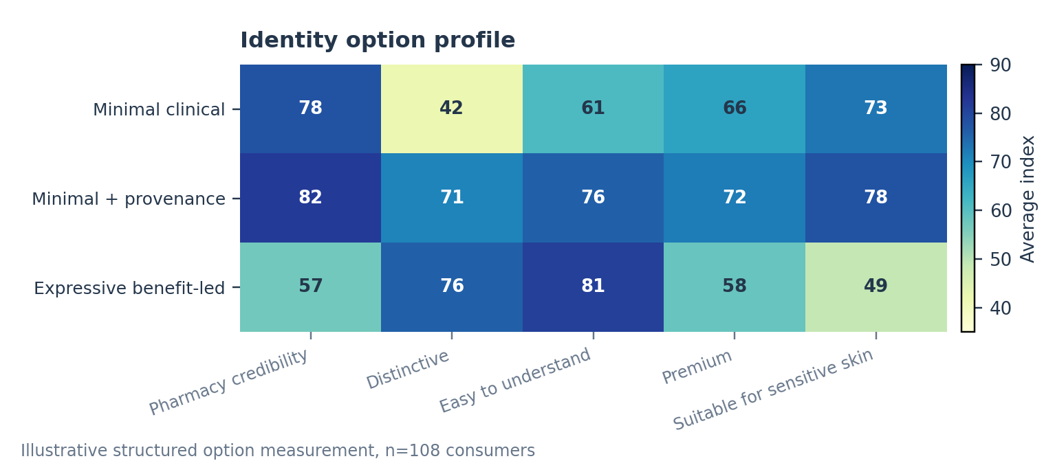
Cue-to-meaning findings
CUE | MEANING CREATED | DECISION IMPLICATION |
|---|---|---|
Restrained clinical system | Safe and pharmacy appropriate | Protect, but avoid complete category conformity |
Provenance or expertise cue | A reason to remember and believe | Make one cue visible and explainable |
Strong benefit colour | Easy to navigate but less clinical | Use selectively for range coding, not the master identity |
Note: Scores and conclusions on this page are hypothetical and demonstrate the analysis structure only.
04 | DECISION AND DELIVERY
Keep the restraint and introduce one ownable proof cue
The strongest route remained pharmacy credible while giving buyers and pharmacists a reason to recognise and explain the brand.
RECOMMENDED DIRECTION Adopt the minimalist identity with one consistent provenance or expertise cue. Use benefit colour for navigation rather than as the main credibility signal, and test all product wording through separate claims and regulatory review.
Identity rules
PROTECT The restrained clinical system and pharmacy suitability cues.
ADD One recognisable proof cue that can be understood without a long explanation.
CLARIFY Product function and selection language at the shelf and digital detail page.
CONTROL Colour, benefit emphasis and unsupported therapeutic interpretation.
Engagement outputs
Identity Signal Map The visual and verbal cues linked to credibility, recognition and expectation.
Option Profile Structured comparison of the three monadic cells.
Pharmacist Explainability View What can be recommended directly and what needs supporting language.
Design Decision Rules Elements to protect, add, clarify and control across touchpoints.
Boundaries and timing This research evaluates brand interpretation, not product safety, suitability, clinical performance, therapeutic claims, legal compliance or trademark availability. Example timing is approximately eight weeks.
Contact Us
DISCUSS YOUR BRAND DECISION
Tell us which identity choices are being considered, where customers encounter them and who influences the decision. We will design the stimulus and evidence sequence accordingly.